I don't normally post twice in one day but I came across these seemingly paired challenges and happened to have the time so I thought I would have a bit of fun. Thanks to Simplicity and My Reflection of Something for their editing challenges. This is her photo and my editing... What do you think? did I improve and enhance or just mess with what should have been left alone?
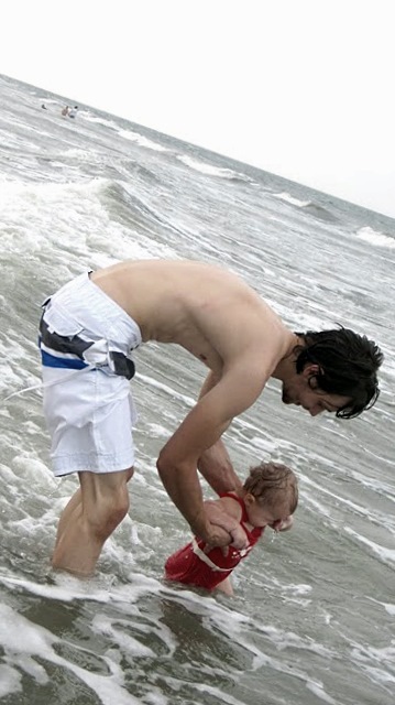
1. This is my edited version of her photo
I took her original photo and I adjusted the color balance, I saturated it a bit and then put a filter on it toning the saturation in the photo down a with a pale yellow. This was done with a free Google editor Picasa
2. This is her original photo no editing.
This next set is from another Blogger with another challenge! It is again editing a photo they provided. So see how you like this set
1. My edit on their photo
This particular picture I felt like had good colors but the people in it didn't pop, they melded into the background. But because of the reds and pinks already in the original a simple saturation wouldn't do without making them look like the latest Dick Clark. So I took the photo made it a whiter tint, heightened the highlights a bit and darkened the shadows then brought the color down to a slightly "cool"-er town. Again this was done with a free Google editor Picasa
2. Their original photo


Awww how sweet!! Eli looks amazing in your edit! :)
ReplyDeleteVery nice - I especially like what you did with Faith's photo.
ReplyDeleteI like what you have done with the photo in the beach. Added a bit of a vintage 'memory' type feel to it.
ReplyDeleteWith the mum/bub one though.. I flick back and forth and the mother is way too yellow. She looks very jaundiced! The photo is lovely on it's own, I"d probably just increase the contrast slightly and dull the hue to give it a colour washed-out look. :)
Keep it up!
very subtle and clean edit thanks for linking up
ReplyDeleteI think your edit of the beach photo is a very nice clean edit. I love that you kept it simple!
ReplyDelete